Mobile Optimization for Your Email Campaigns
To walk you through the process of optimizing your email campaign for mobile phones.
Prefer a shortcut? 16 free tools do parts of this for you.

Aim: To walk you through the process of optimizing your email campaign for mobile phones.
Optimal Outcome: To enhance your email campaign and improve the experience of your customers who use mobile phones to read emails.
What do you need to start:
You’ll need the following:
-
Marketing automation platform
-
Subject Line A/B Testing
-
Mobile-friendly email templates and landing pages
Why is this SOP Important: Optimizing your email campaign for mobile devices can lead to increased email open rates, better user experience, improved engagement, increased revenue, and a competitive advantage.
When and Where to execute: Marketing automation platform
Who Should Be Doing This: Marketing staff, person responsible for setting up email automation campaigns.
What is Mobile Optimized Email Campaign?
A mobile optimized email campaign is an email marketing campaign designed to be viewed and interacted with on mobile devices. With the widespread use of smartphones and tablets, it's essential that emails are optimized for mobile users. This includes a layout and design that is easy to navigate on a small screen, clear and concise messaging with a strong call to action, easy-to-click buttons, and images optimized for mobile. A mobile optimized email campaign is critical for any successful email marketing strategy as it allows businesses to reach and engage with their mobile audience effectively.
Execution
Resources/Tools & Set up
-
Set up A/B Testing for your subject line (Follow this guide SOP 244: A Guide to A/B Testing Subject Lines)
Create mobile-friendly email templates and landing pages
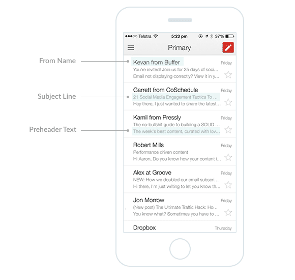
Make sure that the subject line is less than 30 characters. Longer subject lines tend to be cropped in most mobile devices.
- Use pre-header text. It’s the first line of your email in support of your subject line. Below is an example of the elements of your email on an iPhone. Users can adjust the settings to see more elements or characters but this view is default.
-
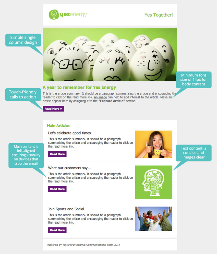
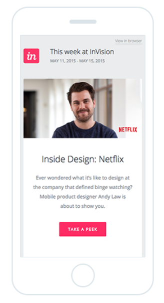
Use one column layout as it is the easiest and the most scannable to view on mobile devices.
-
Use 14 points font size for body and 22 points for headers. Put most of your text on the left side. Email width should not be more than 600 pixels.
-
It's essential to craft concise and easy-to-read content when writing mobile-friendly emails. Break down your message into easily scannable and consumable chunks such as bulleted lists and short paragraphs. This will make it effortless for your reader to comprehend your copy and take the desired action.
-
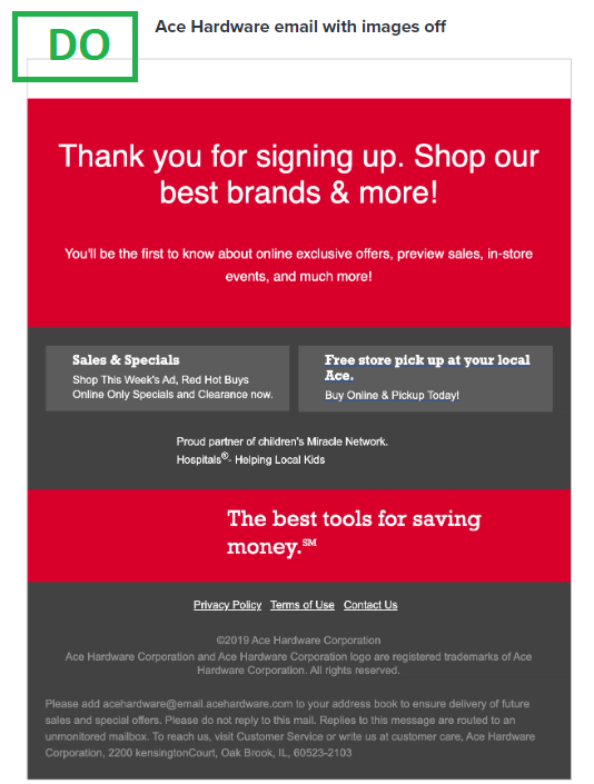
Some mobile devices may not display images automatically. Make sure to design your email with an "images off" experience in mind, ensuring that your message is still understandable even if the images are not displayed. Use Live HTML as much as possible which means adding text and important email components such as CTA button coded using HTML instead of created as a graphic.
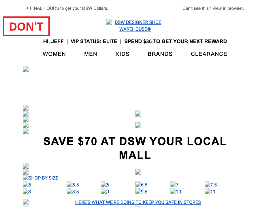
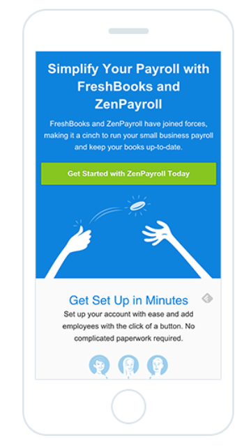
- Make your call to action (CTA) the main focus of your email by placing it front and center. Position the CTA button at the top of the email, and ensure that it is no less than 44 x 44 pixels in size.
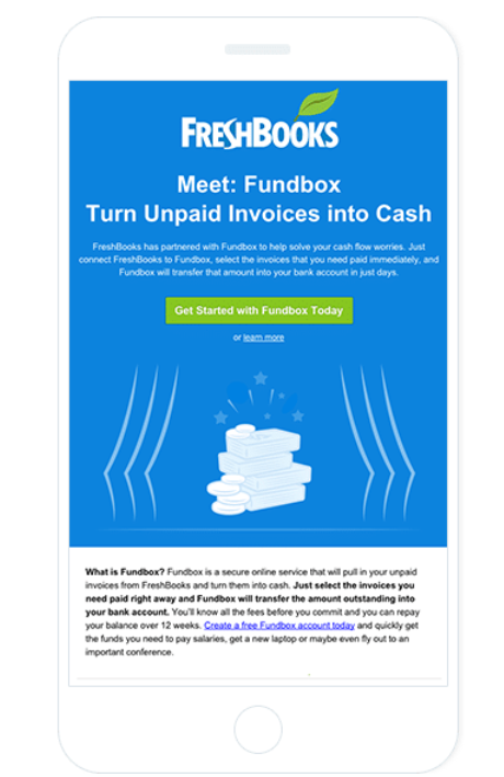
- When designing your mobile-friendly email, keep in mind that you need to make it easy to click on links and CTAs. Ensure that you have enough white space around them. In this example, there’s ample space around the CTA button, making it easy to click without accidentally clicking on other elements.
Set up test email across multiple devices
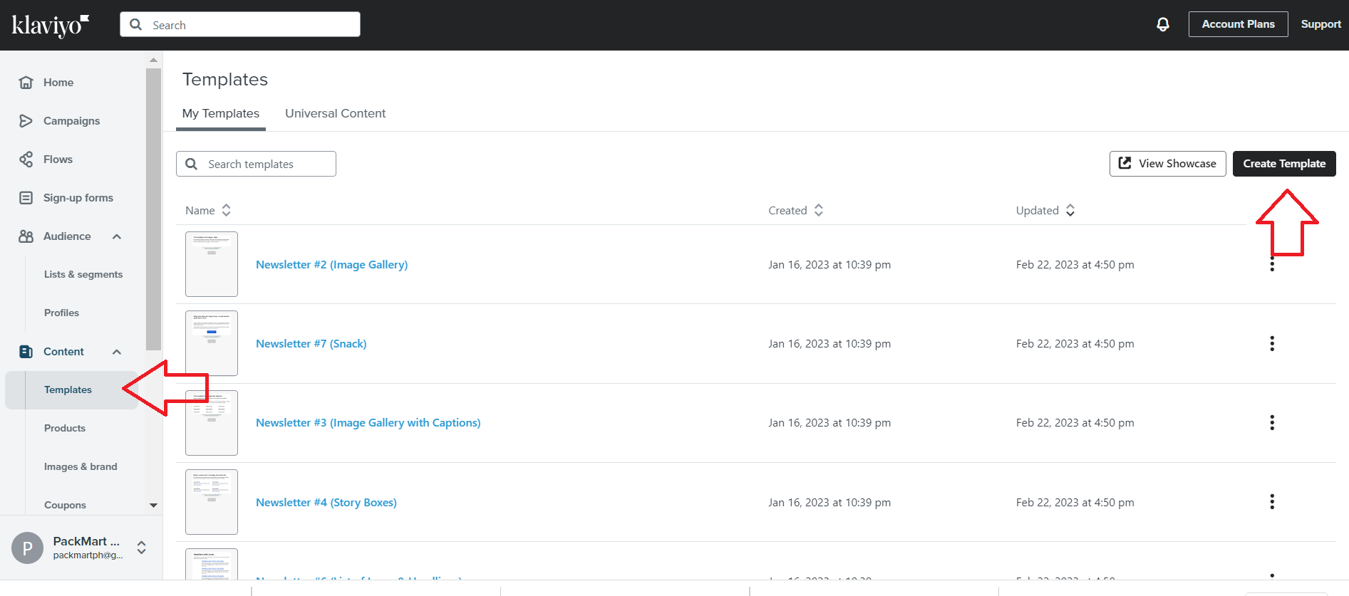
- Login to your Marketing automation platform. (Note: In this SOP, we’ll use Klaviyo for screenshots). In Klaviyo, navigate to the left menu, click Templates, then click Create Template.
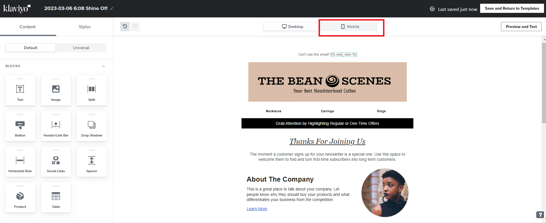
- Once you’re done editing, click the Mobile tab at the top menu.
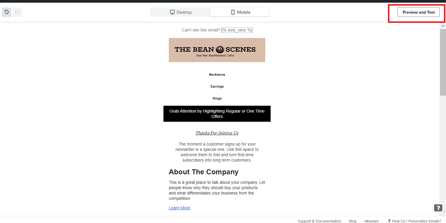
- Click Preview and Test.
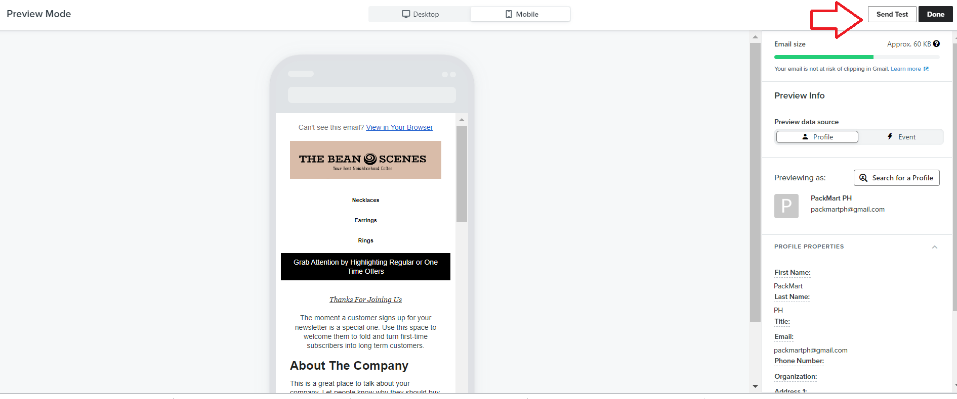
- From the Preview Mode, select Send Test.
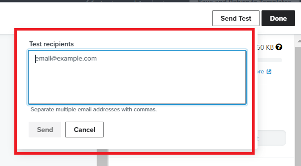
- Enter the email addresses where you want to send the test email. Make sure to open the email in as many different device types as possible.
Conclusion
That’s it! Remember that optimizing email campaigns for mobile devices is crucial because more than half of email opens occur on mobile devices.
Execution Checklist:
-
Marketing automation platform
-
Subject Line A/B Testing
-
Mobile-friendly email templates and landing pages
Email Campaign Mobile Optimization Best Practices:
-
Mobile screens are smaller than desktop screens, so keep your emails concise and to the point. Use clear and concise subject lines, and make sure your content is scannable and easy to read.
-
Responsive design ensures that your email looks great on any device, regardless of the screen size. Use a responsive email template that adjusts to the size of the device, and test your emails on different mobile devices to ensure they look good on all of them.
-
A single-column layout works best for mobile devices because it’s easier to read and scroll. Use a layout that is no wider than 600 pixels to ensure that it fits on all mobile screens.
-
Use a font size of at least 14 points for body text and 22 points for headings. This makes it easy for readers to read your content without having to zoom in.
-
Use images sparingly and make sure that they are optimized for mobile devices. Use alt tags to describe your images so that they can be understood by users who have images turned off.
-
Make sure your call to action (CTA) is clear and easy to click on. Use a button with a contrasting color to make it stand out, and make sure it’s large enough to be clicked on easily.
-
Test your emails on different devices and email clients to ensure that they look good and are functional on all of them. Make sure your links work and your images are displayed correctly.