Best Practices for High Converting Product Landing Pages on Shopify
This SOP aims to guide Shopify store owners and marketers in creating high converting product landing pages by following best practices.
Prefer a shortcut? 16 free tools do parts of this for you.

Aim: This SOP aims to guide Shopify store owners and marketers in creating high converting product landing pages by following best practices.
Optimal Outcome: The optimal outcome of following this SOP is to create product landing pages that effectively communicate the value of the product, establish trust with the potential customer, and ultimately increase conversion rates.
What do you need to start: To start, you will need access to your Shopify store and its product pages, as well as a clear understanding of your target audience and the unique value proposition of your product.
Why is this SOP Important: Product landing pages are critical to the success of any ecommerce store, as they serve as the primary point of contact between the potential customer and the product. By following best practices, you can ensure that your landing pages are optimized to communicate the value of the product and increase conversion rates.
When and Where to execute: This SOP can be executed at any time during the product launch process or when updating existing product landing pages. It can be executed from any location with access to the internet.
Who Should Be Doing This: Shopify store owners, marketers, and anyone responsible for creating or optimizing product landing pages.
What is a landing page?
A landing page is a standalone web page that focuses on promoting a specific product or offer and encourages visitors to take a desired action. It can be a valuable tool for your Shopify store as it increases conversion rates, targets specific audiences, and improves tracking and analytics. By creating clear and compelling calls-to-action and tailoring landing pages to specific marketing or advertising campaigns, your Shopify store can drive more sales and improve overall performance.
Execution
Resources/Tools & Set up
- Shopify account
Choose the right landing page type
Landing pages are an essential element of any digital marketing campaign, including those for Shopify stores. A landing page is a standalone web page designed to promote a specific product or offer and encourage visitors to take a desired action. They can be a valuable tool for driving conversions and improving overall performance for your Shopify store.
There are two main types of landing pages: click-through landing pages and lead generation landing pages.
-
Click-through landing pages: This type of landing page is designed to encourage visitors to click through to a product or offer page, where they can make a purchase or take a desired action. These landing pages typically feature a clear and compelling headline, high-quality images or videos, and a prominent call-to-action button.
-
Lead generation landing pages: This type of landing page is designed to collect visitor information, such as email addresses, through a form. These landing pages typically offer something of value, such as a free e-book or webinar, in exchange for the visitor's contact information. The form on the landing page is the primary call-to-action, and the success of the landing page is measured by the number of leads generated.
Both types of landing pages can be effective for driving conversions and improving overall performance for your Shopify store. The type of landing page you choose to use will depend on the specific goals of your marketing or advertising campaign.
Follow the best practices in creating landing pages
- Have a clear and concise headline
A clear and concise headline that effectively communicates your value proposition is crucial in capturing the user's attention and encouraging them to continue exploring your landing page. It should be the first thing a visitor sees upon arriving at your page and should clearly state the benefit or solution that your product or service offers. Avoid using jargon or complex language and keep it simple and straightforward.
Example: The landing page for the online course provider Coursera uses a clear and compelling headline that highlights the benefits of its courses.

- Utilize attention-grabbing visuals
Using attention-grabbing visuals is an effective way to enhance the visual appeal of your landing page and capture the user's attention. The right visual elements can help create a lasting impression and make your product or service more memorable.
It's important to use high-quality, relevant images that are consistent with your brand's identity and messaging. Additionally, visual cues such as arrows or buttons can guide the user's attention to important areas of your landing page, such as your call-to-action (CTA) button. This can help increase the chances of conversion and make it easier for users to navigate through your page.
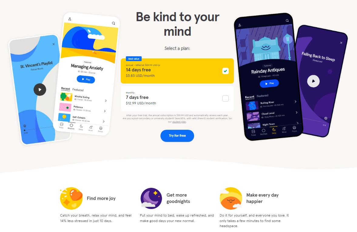
Example: The landing page for the meditation app Headspace uses visually appealing graphics that communicate the benefits of the app.
- Present social proof
Using social proof is a powerful way to build credibility and trust with potential customers, ultimately increasing the chances of conversion. Social proof can come in many forms, such as customer testimonials, ratings and reviews, endorsements from influencers or industry experts, and social media shares or likes.
Including social proof on your landing page can help alleviate any doubts or concerns that potential customers may have about your product or service, and demonstrate that others have had a positive experience with your brand.
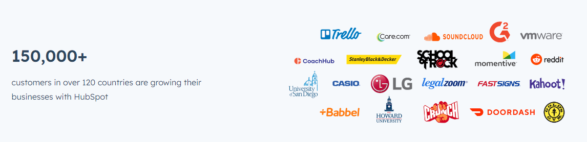
Another effective way to use social proof is to showcase any media coverage or recognition that your brand has received. This can help establish your brand as an authority in your industry and increase your credibility in the eyes of potential customers. For instance,
Example: HubSpot's landing page includes a section dedicated to showcasing their well-known clients which helps build trust with potential customers and position them as a leader in the marketing industry.
- Use a clear call-to-action
Using a clear and prominent call-to-action (CTA) is crucial to ensure that potential customers take the desired action on your landing page. A CTA should clearly communicate what the user can expect by clicking the button, and be visually distinguishable from the rest of the page content.
The placement and wording of your CTA can have a significant impact on the success of your landing page. For instance, placing your CTA above the fold (i.e., the visible area of the page before scrolling) can increase the visibility and chances of conversion. In addition, using action-oriented language such as "Get started," "Join now," or "Claim your free trial" can create a sense of urgency and motivate users to take action.
It's also important to make sure that your CTA is relevant to the content on your landing page, and that the landing page itself is designed to encourage the desired action.
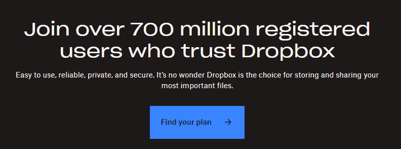
Example: Dropbox's landing page includes a clear and prominent CTA that encourages visitors to find the plan that best suits their needs and the page is designed to highlight the features and benefits of the service to encourage conversions.
- Implement a simple and clutter-free design
Using a simple and clutter-free design can help ensure that visitors focus on the most important elements of your landing page and increase the chances of conversion. Here are some best practices for achieving a simple and effective design:
-
Use a clean and easy-to-read font
-
Limit the number of colors and use a consistent color scheme
-
Use white space effectively to create a sense of balance and clarity
-
Keep the layout and structure of the page simple and easy to navigate
-
Use high-quality images that support the content and are visually appealing
-
Avoid using too many graphics, animations, or distracting elements that may detract from the main message
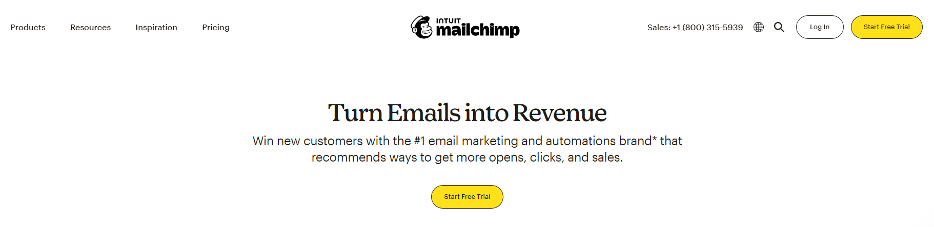
Example: Mailchimp landing page features a clean and easy-to-read font, a simple color scheme with contrasting accent colors, and a clear and prominent CTA. The layout is straightforward and easy to navigate, and the use of white space creates a sense of balance and clarity. The page also uses high-quality images that support the content and are visually appealing without being distracting.
- Apply scarcity and urgency
Using scarcity and urgency can create a sense of urgency and encourage visitors to take action. This can be achieved by using phrases such as "limited time offer," "while supplies last," or "only a few left." You can also use a countdown timer to create a sense of urgency and encourage visitors to take action before the offer expires.
Example: Amazon landing page during Black Friday or Cyber Monday sales. They often use limited-time offers and countdown timers to create urgency and encourage visitors to take action.
- Write benefit-driven copy
Using benefit-driven copy is an effective way to communicate the value of your product and persuade visitors to take action. Here are some tips for creating benefit-driven copy on your landing page:
-
Focus on the benefits, not just the features, of your product.
-
Use clear and concise language that is easy to understand.
-
Use strong action verbs to convey a sense of urgency and encourage visitors to take action.
-
Use specific examples and statistics to support your claims.
-
Use customer testimonials and reviews that focuses on the benefits of your products
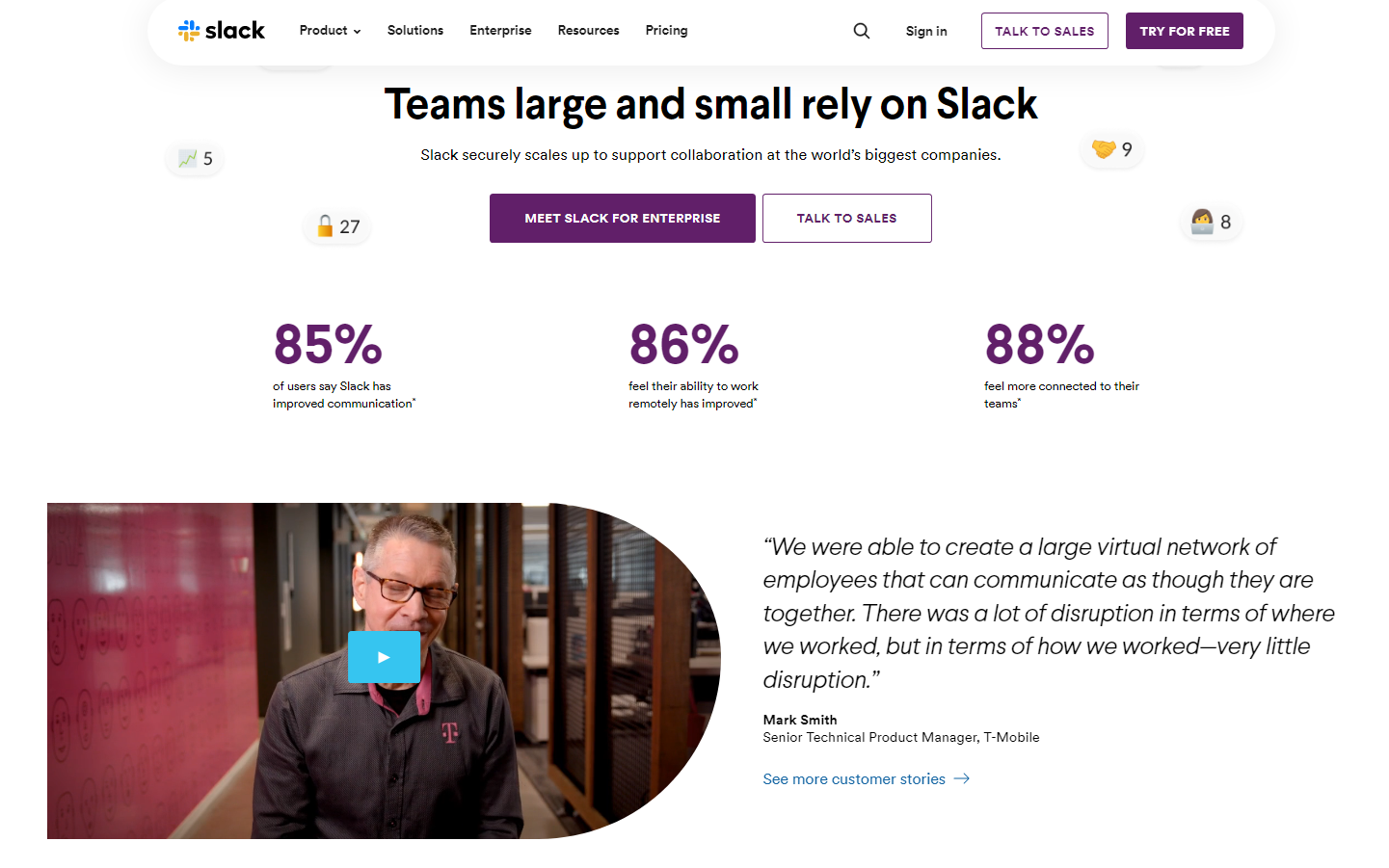
Example: Slack uses clear and concise language to communicate the benefits of their product and highlight how it can help users be more productive and efficient. They also use statistics, customer testimonials and reviews to provide social proof and build trust.
- Incorporate a clean and easy-to-use form
Using a clean and easy-to-use form is essential in creating a high-converting landing page. A form is a crucial part of the landing page as it is where you collect important information from your potential customers. A simple and clutter-free form with clear labels and input fields makes it easy for users to understand what information they need to provide. By keeping the form short and only asking for essential information, you reduce the risk of overwhelming the user and discouraging them from completing the form.
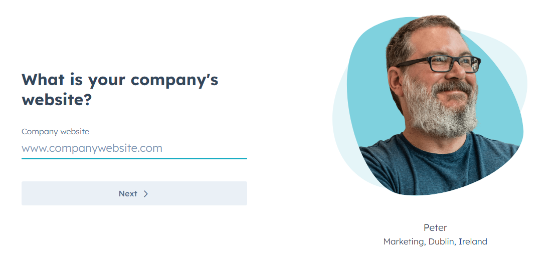
Example: HubSpot uses a simple and straightforward form that only asks for essential information, such as the visitor's email address and website URL. They also use clear and concise language to explain what the visitor will receive by submitting the form and use a contrasting color for the call-to-action button to make it stand out.
- Implement a responsive design
Using a responsive design for your landing page ensures that your page is accessible and user-friendly for everyone, no matter what device they're using to access it. Here are some points to keep in mind when it comes to using a responsive design for your landing page:
-
Make sure your landing page is optimized for mobile devices as well as desktops
-
Use a responsive design that adjusts to different screen sizes and resolutions
-
Use larger fonts and buttons to make it easy for users to navigate on smaller screens
-
Test your landing page on different devices and browsers to ensure it works properly
-
Make sure your images and videos are optimized for mobile viewing and load quickly on all devices
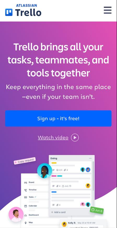
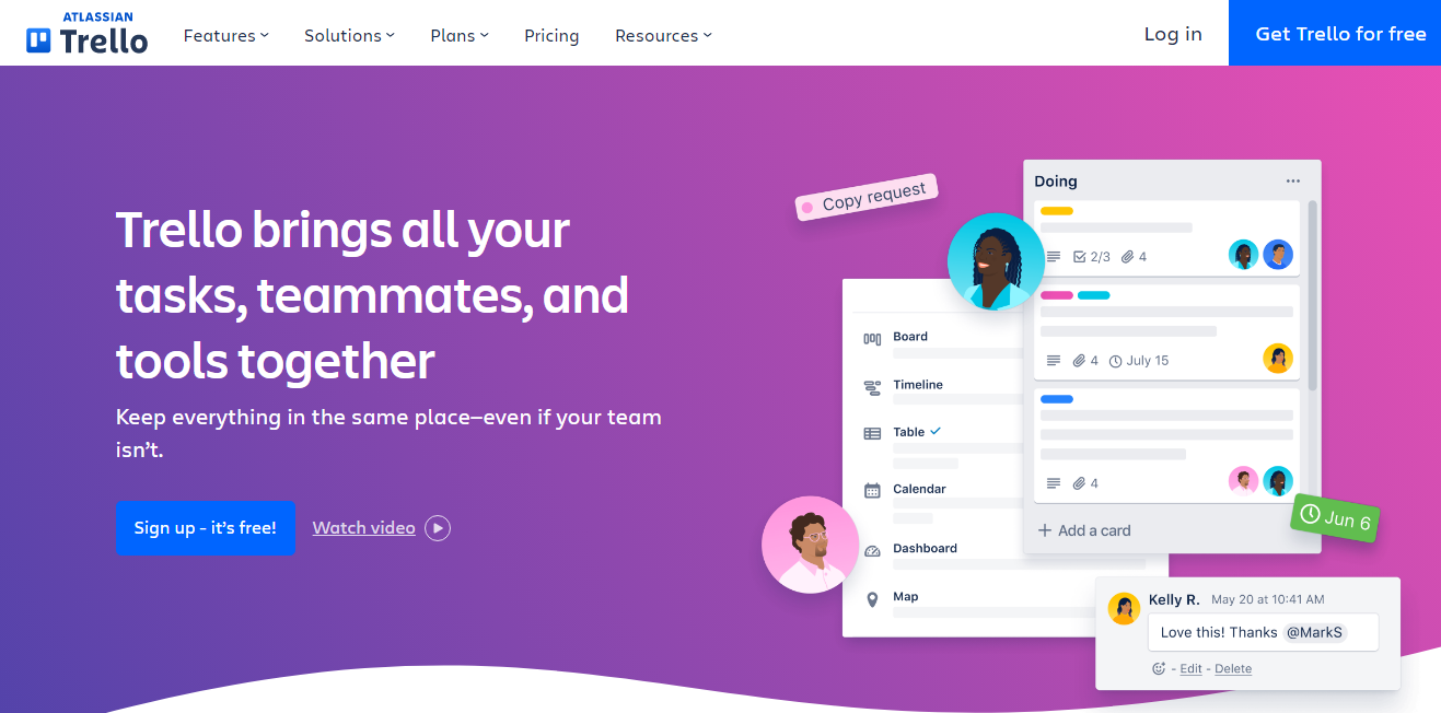
Example: The landing page for the productivity app Trello uses a responsive design that works on all devices.
Website Mobile
- Use clear and concise language
Using clear and concise language can help you communicate your value proposition more effectively and make it easier for visitors to understand why they should take action. This can ultimately lead to higher conversion rates and better results for your business. Here are some tips to keep in mind when writing your landing page copy:
-
Use simple, straightforward language that's easy for your target audience to understand
-
Avoid using jargon or technical terms that might confuse or intimidate your visitors
-
Use short sentences and paragraphs to make your content easy to scan and digest
-
Use active voice instead of passive voice to make your content more engaging and persuasive
-
Focus on benefits, not just features. Use language that highlights how your product or service can solve a specific problem or meet a specific need.
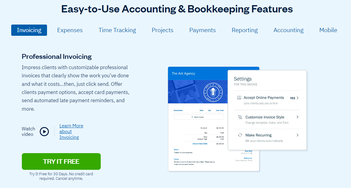
Example: The landing page for the invoicing software FreshBooks uses clear and concise language.
- Use a strong and memorable brand identity
Having a strong and memorable brand identity is a crucial aspect of creating a high-converting landing page. It helps your audience recognize your brand and differentiate it from competitors. To achieve this, here are some tips to keep in mind:
-
Use consistent branding throughout the landing page, including logos, fonts, and colors
-
Make sure your branding aligns with your overall marketing strategy and target audience
-
Use high-quality visuals, such as images and videos, that reinforce your brand identity
-
Use language and messaging that's consistent with your brand voice and tone
-
Create a unique value proposition that sets your brand apart and resonates with your target audience
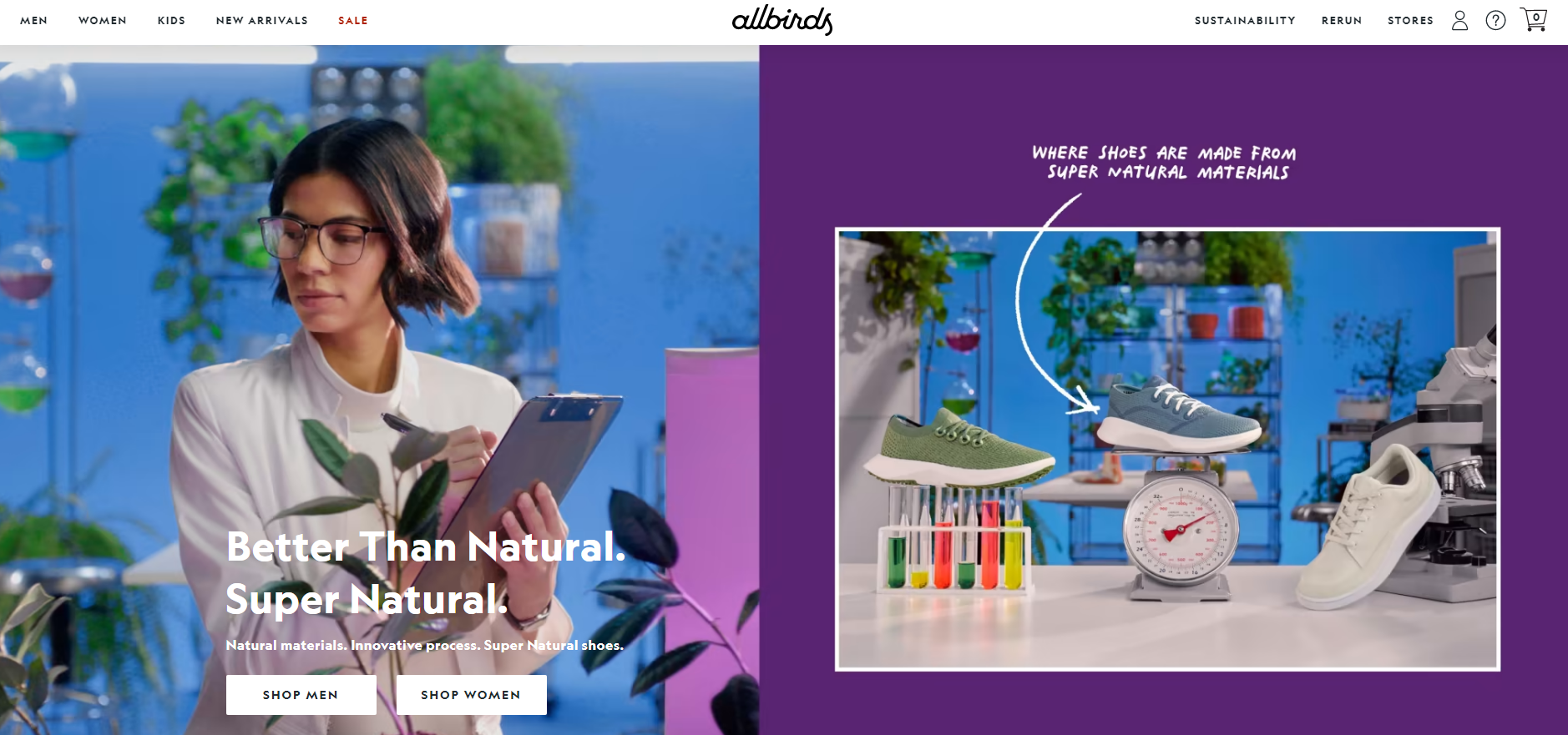
Example: The landing page for the shoe company Allbirds uses a strong and memorable brand identity that communicates its unique value proposition.
- Perform A/B testing
A/B testing is a process of comparing two versions of a landing page to determine which one performs better in terms of conversion rate. This method involves creating two versions of a landing page with a slight variation in design, copy, or call-to-action, and then showing each version to a random subset of visitors. The results are then compared to determine which version performed better. A/B testing is crucial in optimizing landing pages as it allows you to identify which elements of the page are contributing to higher conversion rates and make data-driven decisions to improve the page's performance.
There are several elements of a landing page that can be tested using A/B testing to optimize conversions. Here are some examples:
-
Headline and subheadline
-
Call-to-action (CTA) button text, color, and placement
-
Images and videos
-
Form length and fields
-
Social proof elements, such as testimonials and reviews
-
Layout and design
-
Navigation and menu options
-
Value proposition and messaging
Conclusion
You’re done! Remember, designing and creating a high-converting product landing page on Shopify requires careful attention to detail and adherence to best practices. By following these best practices, you can create a high-converting product landing page on Shopify that drives sales and helps you achieve your business goals.
Execution Checklist:
-
Choose the right landing page type for your product and target audience
-
Craft a clear and concise headline that communicates your value proposition
-
Use attention-grabbing visuals that are relevant to your product
-
Leverage social proof, such as customer reviews or endorsements
-
Create a clear call-to-action that stands out and is easy to follow
-
Keep your design simple and clutter-free, with plenty of white space
-
Create a sense of scarcity and urgency through time-limited offers or inventory limits
-
Write benefit-driven copy that focuses on how your product can solve your customers' problems or meet their needs
-
Use a clean and easy-to-use form that captures only the essential information
-
Ensure your landing page is responsive and optimized for mobile devices
-
Use clear and concise language that is easy to understand
-
Establish a strong and memorable brand identity that resonates with your target audience
-
Perform A/B testing to identify and optimize key elements of your landing page over time.