User-friendly SEO Blogs in Shopify
The purpose of this method is to check if your Shopify website is properly displayed on mobile devices.
Prefer a shortcut? 16 free tools do parts of this for you.

Aim: The purpose of this method is to check if your Shopify website is properly displayed on mobile devices.
Optimal Outcome: This procedure will result to a mobile responsive website which helps businesses improve their visibility in search engine results, leading to an increase in organic traffic and conversions.
What do you need to start: You need to have your Shopify Store URL, and Google Chrome browser ready to start this procedure.
Why is this SOP Important: Mobile friendly SEO blogs allow businesses to better engage with customers and prospects, as they can easily be accessed via a smartphone or tablet device. By optimizing content for mobile devices, businesses can improve their reach and ensure that their content is seen by the right people.
When and Where to execute: You should use this strategy as soon as you launch your website. Then every time you modify the theme of your website.
Who Should Be Doing This: This is the responsibility of the person in charge of your website.
What is Mobile friendly SEO Blogs
Mobile friendly SEO blogs are critical to Shopify since they are an essential component of any effective search engine optimization (SEO) strategy. Businesses may boost their exposure in search engine results by providing content that is suited for mobile devices, resulting in an increase in organic traffic and transactions. Since they are easily accessible via a smartphone or tablet device, mobile friendly SEO blogs enable businesses to better communicate with consumers and prospects. Businesses may increase their reach and guarantee that their material is seen by the correct people by optimizing their content for mobile devices. Mobile friendly SEO blogs may assist Shopify companies in creating more engaging content by allowing them to integrate multimedia components to generate more visually attractive material that can retain readers' interest for longer periods of time.
Execution
Google Mobile Friendly Test thru Google Chrome
- Open your Google Chrome browser.
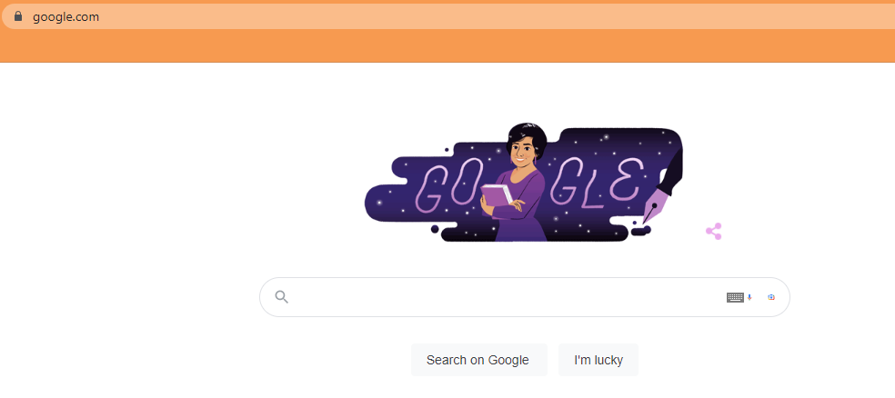
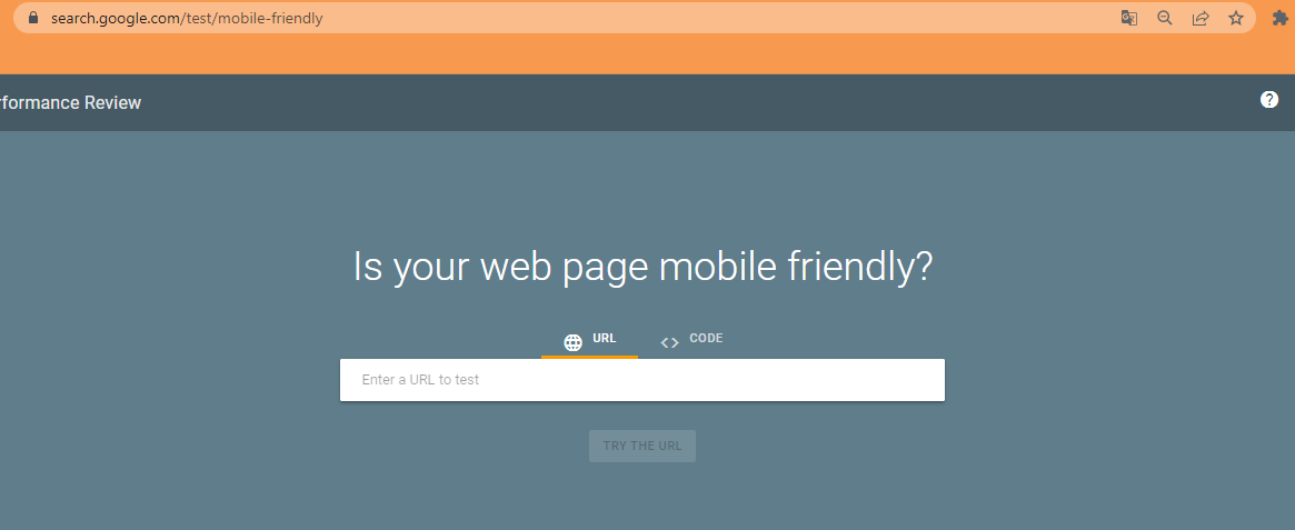
- Go to Google Mobile Friendly Test page. Type in your website URL into the box.
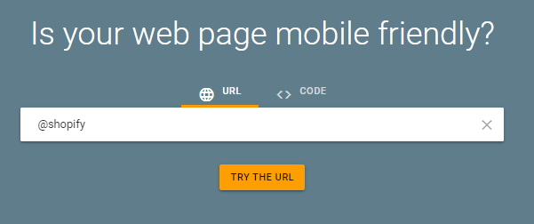
- Click on the “Test URL” button.
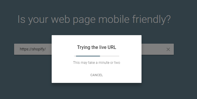
- Answer the Captcha puzzle if required.

- Wait until “Analyzing” is completed.
- Results will then be shown to you. If your page isn't "mobile friendly," you might want to switch to a different theme or make some changes to an existing one.
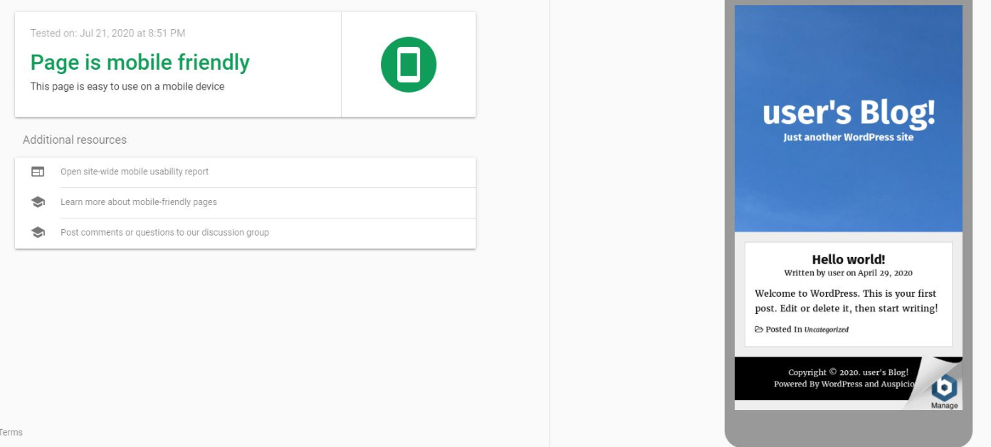
- Google Mobile Friendly Test by inspecting it
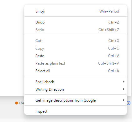
- Log in to your Shopify website using Chrome browser. Right click anywhere on free space of your website and choose Inspect.
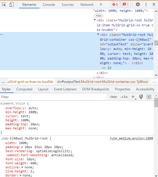
- It will then display the "Developer Tool". Choose "Toggle device toolbar."
- The appearance of the website will vary when viewed on a mobile device.
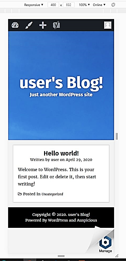
- You can opt to alter the format to one compatible with other common mobile devices by picking it from a dropdown list.

- Congratulations! You can now determine whether your online business is mobile-friendly.

Conclusion
You’re done! Keep in mind that mobile friendly SEO blogs are vital to Shopify, as they are an important part of any successful search engine optimization (SEO) strategy.
-
businesses can improve their visibility in search engine results, leading to an increase in organic traffic and conversions;
-
allow businesses to better engage with customers and prospects, as they can easily be accessed via a smartphone or tablet device;
-
businesses can improve their reach and ensure that their content is seen by the right people; and
-
help Shopify businesses create more engaging content, as they can use multimedia elements to create more visually appealing content that can hold readers’ attention for longer.
Execution Checklist:
-
Visit Google Mobile Friendly Test using Google Chrome.
-
Click the "Test URL" button after typing the website URL in the box.