
Do Lifestyle Images Increase Shopify Conversion Rate?
You've seen the stat: lifestyle photos convert 30% better. Nobody can tell you where it came from. Here's what the research actually says, when lifestyle images win, when they backfire, and where each photo belongs in your gallery.

"Lifestyle photos convert 30% better."
I've heard that line from photographers, app founders, agency decks, and more than one founder who wanted to book a four-figure photo shoot before we'd looked at a single number on their store. So I went looking for where it came from.
I couldn't find it. Not in a peer-reviewed paper. Not in a named, controlled test with a sample size. What I found was the same claim, in slightly different sizes (18%, 22%, "20 to 30%"), repeated across photography vendor blogs, usually credited to "aggregated A/B tests" or "merchant data" that nobody publishes.
So here's the direct answer to the question. Do lifestyle images increase Shopify conversion rate? Often, yes, when the image answers a question the buyer is asking: how big is it, how does it look in a real room, how would I use it, does it suit someone like me. The research on that is solid. But lifestyle images can also lower conversion rate when they hide the product, show a buyer your customer doesn't identify with, or make an unpleasant product feel vivid. The style of the photo isn't the lever. The job the photo does is.
The rest of this post is the evidence, the exceptions, a slot-by-slot plan for your gallery, and how to test it on your own traffic so you never have to trust a vendor stat again.
A lifestyle photo is a claim about the buyer's life. If the buyer doesn't recognize their life in it, it's just a nice picture.
Where does the "lifestyle photos convert 30% better" number come from?
Mostly from people who sell photos.
That's not a knock on photographers. It's just worth knowing who's talking. When I traced versions of the stat, they led back to product photography studios, AI image apps and ecommerce tool blogs. The typical citation is a phrase like "aggregated test data across DTC brands" or "in Shopify merchant data," with no brand names, no product categories, no traffic numbers, no test length and no statistical method.
Here's the problem with a number like that, even if the tests were real:
- Selection bias. Brands that run a lifestyle test and win tend to talk about it. Brands that test and lose rarely write a blog post about it.
- Bad baselines. "Lifestyle beat white background" often means "a new, well-shot lifestyle photo beat an old, badly lit product photo." That's a quality test, not a style test.
- Category mixing. A 25% lift on apparel, where the on-model shot is the whole sale, tells you nothing about a replacement water filter.
- Conversion rate only. Almost none of these claims report average order value or returns. A photo that raises orders but also raises "not what I expected" returns isn't a win.
None of that proves lifestyle images don't work. It means the 30% is a sales line until someone publishes the test. So let's look at what's actually been studied.
What does the research actually say about lifestyle images?
There's no single study that answers "lifestyle versus white background" for every store. But three bodies of research get close, and together they explain when lifestyle photos help and when they don't.
1. Buyers use photos to judge size, and many sites still don't help them
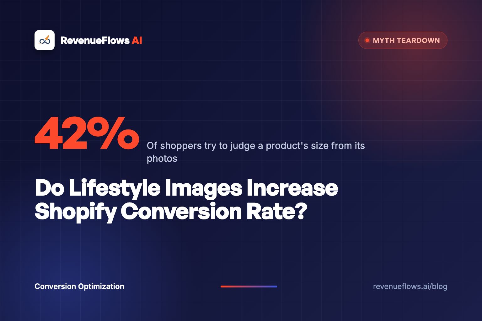
Baymard Institute's product page research found that 42% of users try to gauge a product's scale from its images, and 56% of users explore product images before they read the description. At the time of that study, 28% of major ecommerce sites didn't provide a single "in scale" image, meaning a photo that shows the product next to a person, a hand or a familiar object.
That's the strongest case for lifestyle photos, and notice what it's really about. It's about scale. A lifestyle shot of a sofa in a living room works because the buyer can finally see that it's a 3-seater, not a loveseat. Baymard even notes that in-scale images can double as lifestyle images, like a portable speaker being pulled out of a bag at a party. The emotion comes along for free. The information is what closes the sale.
2. For fit and appearance products, people on models aren't optional
Baymard's research on showing products on a human model found that for apparel, accessories and cosmetics, shoppers struggled to judge fit, length and look from cut-out product shots alone. In testing, users rejected cosmetics when the models didn't match their own skin tone, and wanted to see shoes on an actual foot.
Two lessons live in that finding. First, for these categories, a lifestyle or on-model photo carries information a white background can't. Second, the person in the photo matters. A model who looks nothing like your buyer can do more harm than no model at all.
3. Photos that help people imagine using the product raise purchase intent, with a catch
In a 2012 paper in the Journal of Consumer Research, Ryan Elder and Aradhna Krishna showed that small visual details that make it easier to mentally simulate using a product, like turning a mug's handle toward the viewer's dominant hand, raised purchase intentions across four studies. They called it the visual depiction effect.
That's the science underneath the lifestyle photo. When a buyer can picture themselves using the product, they're more likely to buy it.
But the same paper found two limits that almost nobody quotes. The effect weakened when people's attention was taken up by something else. And for negatively valenced products (things tied to something unpleasant), making the use easier to imagine actually lowered purchase intentions.
Read that again, because it's the most useful finding in this whole post. If you sell a drain cleaner, a lice treatment or a mole repellent, a vivid "here's you using it" photo can push buyers away. For those products, the winning image usually shows the result (the clear drain, the clean yard), not the moment of use.
| Source | What it found | What it means for your page |
|---|---|---|
| Baymard, in-scale images | 42% of users judge scale from photos; 56% look at images before reading | At least one photo must show size against a person or familiar object |
| Baymard, human models | Fit and appearance products need people; the wrong model hurts | Use models who look like your actual buyers |
| Elder and Krishna, 2012 | Easier mental simulation raises purchase intent, but backfires for unpleasant products | Show use for pleasant products, show the result for unpleasant ones |
The research doesn't say "lifestyle photos sell." It says "photos that answer the buyer's question sell." Sometimes that's a lifestyle photo.
What job does each image on a product page do?
This is where most stores go wrong. They treat the gallery like a mood board. It's actually a sequence of answers.
Think about what a buyer is asking as they swipe through your photos on a phone. The first image has to answer "what is this?" at thumbnail size, often in a collection grid or a Google Shopping ad, before they've even clicked. The next few have to answer "will it fit my life?" Then "is it well made?" Then "what's the catch?"
Different questions need different photos:
| Gallery slot | Buyer's question | Best image type |
|---|---|---|
| 1 | What exactly is this? | Clean shot of the whole product, white or light background |
| 2 | How big is it, and how would I use it? | In-scale or lifestyle shot with a person or familiar object |
| 3 | Is it well made? | Close-up of the main material, feature or mechanism |
| 4 | What's the catch? | A photo that answers the top objection (the cord length, the fold, the fit) |
| 5 | What do I get? | What's in the box, or sizes side by side |
| 6+ | Do people like me actually use it? | Customer photos from reviews |
Notice where the lifestyle photo sits. Slot two, not slot one. That's not a rule for every store (more on the exceptions below), but it's the right default, because the first image has two jobs a lifestyle photo is bad at: being recognizable at 150 pixels wide, and following marketplace rules.
On that second point, Amazon's image rules require the main image to be the product on a pure white background, filling about 85% of the frame. Google's Merchant Center guidance recommends a white or light background for the main product image outside of apparel. If you sell on Amazon or run Shopping ads, you already need a clean hero shot. Use it.
Customer photos in slot six and beyond are their own lever. We looked at them separately in do customer photos increase Shopify conversion rate, and the short version is that they do a job no studio photo can: proof that real buyers use the thing.
When do lifestyle images hurt conversion rate?
Here's the part the 30% stat leaves out. Lifestyle photos can cost you sales in at least six ways.
When the product disappears
The classic mistake: a gorgeous, moody photo of a woman on a sofa at golden hour, wrapped in a throw blanket, where the throw is 8% of the frame and the color is impossible to see. It looks like an ad. It works like a stock photo. If a buyer can't tell what you're selling from the image, the image is decoration.
A quick test: cover the product name on your page and show someone the photo on your phone for three seconds. If they can't tell you what's for sale, the photo belongs in an Instagram post, not slot one.
When the buyer doesn't see themselves
Baymard's cosmetics finding applies well beyond makeup. A 25-year-old fitness model on a page selling orthopedic pillows to people over 50 creates a quiet "this isn't for me." The model is aspirational. The buyer is practical. Show the actual customer, in the actual setting, doing the actual thing. If you build those scenes with AI, start from a locked packshot, the way our Nano Banana product photos workflow does.
When it's obviously stock
Buyers have seen the same laughing-woman-with-salad photo on a hundred sites. A generic lifestyle stock photo reads as "this brand doesn't have real photos of its product," which is worse than no lifestyle photo at all. We covered this in detail in do stock photos hurt Shopify conversion rate.
The same risk now applies to AI-generated lifestyle scenes. They can be useful for placing a product in a room, but warped hands, impossible reflections or a product that subtly changes shape between photos will cost you trust. The trade-offs are in do AI generated product images hurt Shopify conversion rate.
When the product is unpleasant
This is Elder and Krishna's backfire finding in practice. Products tied to pests, odors, illness or embarrassment usually sell better on the result than on the moment of use. Show the clean kitchen counter, not the ant trail being sprayed.
When the files are huge
Lifestyle photos are usually wide, detailed, full-bleed images. Uploaded straight from a photographer's hard drive, they can be several megabytes each. On a mid-range phone on a weak connection, a slow gallery can cost you the sale before the lifestyle photo even appears. Compress everything and check your page on your own phone, on cellular, not office Wi-Fi.
When the gallery buries the answer
Some stores add six lifestyle photos and push the close-up, the dimensions and the what's-in-the-box shot to slots nine through twelve, where almost no one swipes. We've seen enough stores where the carousel itself was the leak that we wrote a whole post on whether image carousels hurt Shopify conversion rate. More photos isn't better. The right photo in the right slot is.
Which products need lifestyle images the most?
Not every product benefits equally. Here's how I'd sort it:
| Product type | Why | Lifestyle priority | Example |
|---|---|---|---|
| Style is the product | Buyer is asking "does it go with my space or look?" | Highest, can be slot one | Apparel, home decor, jewelry |
| Size is hard to judge | Buyer can't picture the scale | High, slot two | Furniture, luggage, rugs, planters |
| Use is the benefit | Buyer needs to picture the moment | High, slot two | Heated blankets, camping gear, kitchen tools |
| Specs drive the choice | Buyer is matching a part or a number | Low, one in-scale shot is enough | Filters, cables, replacement parts |
| Unpleasant problem | Vivid use can backfire | Show the result, not the use | Pest control, cleaning, medical |
Furniture is the clearest case. If you're selling a $340 accent chair, the in-scale shot next to a person is the single photo most likely to stop the "will it fit" hesitation. Our Shopify furniture product page optimization teardown walks through how that plays out across a whole page. For decor, where style is the product, the lifestyle shot can reasonably lead the gallery, and the Shopify home decor product page optimization breakdown covers when to make that switch.
Heated blankets sit in the "use is the benefit" row. The buyer is buying the feeling of a warm couch in January, so the lifestyle shot matters. But that category also shows the trap: a cozy throw photographed across a sofa looks enormous, then arrives as a 50 by 60 inch throw that barely covers a queen bed. That's why the heated blanket product page optimization teardown pairs every lifestyle photo with the dimensions against the bed.
The lifestyle photo sells the feeling. The in-scale photo keeps the sale from coming back as a return.
How should you order images on a Shopify product page?
Here's the default sequence I'd start with on almost any product. Adjust it to the table above.
- Hero shot. Whole product, clean background, filling most of the frame. Recognizable at thumbnail size.
- In-scale or lifestyle. The product with a person, a hand or a familiar object. Real setting, real buyer.
- Feature close-up. The material, the stitching, the mechanism, the thing that justifies the price.
- Objection photo. The one image that answers the question in your support inbox. How it folds. How long the cord is. What it looks like after a wash.
- What's in the box or size comparison. Every variant side by side, or the full kit laid out.
- Customer photos. From reviews, with permission.
A few Shopify-specific notes. Most themes show the first image in collection grids and on social shares, so slot one does double duty. Many themes also let you show a second image on hover in the collection grid, which is a perfect spot for your in-scale or lifestyle shot. And write real alt text for every image ("walnut accent chair next to a person, 32 inches tall"), because it helps both accessibility and image search.
If you're launching something new and don't have customer photos yet, slots two and four matter even more, because you've got less proof to lean on. We cover that situation in how to write a Shopify product page for a new product launch.
How do you test lifestyle images without fooling yourself?
Don't trust my defaults either. Test them. Here's how to do it without fooling yourself.
- Change one thing. Swap which image sits in slot two. Don't reshoot the whole gallery and call it a test.
- Run it for at least two full weeks. Weekday and weekend buyers behave differently, and a single promotion can wreck a three-day test.
- Measure revenue per visitor, not just conversion rate. A lifestyle photo that shows a matching throw pillow might not change conversion rate but can lift average order value. You want to see both.
- Split by device. Mobile shoppers see one image at a time. Desktop shoppers see thumbnails. A photo can win on one and lose on the other.
- Watch returns for 30 to 60 days. If the new photo raises orders and "not as pictured" returns in the same stroke, you didn't win.
- Get enough traffic. If a product gets 300 visitors a month, you won't get a clear answer in two weeks. Test on your best-selling pages first, where the traffic can actually tell you something.
That last point matters more than it sounds. On low-traffic products, skip the test and follow the research: add one real in-scale photo in slot two. It's hard to see how that hurts.
What's a better photo sequence worth in revenue per visitor?
Here's the math. Run the numbers on a store like this (hypothetical, not a client): a $340 accent chair, no in-scale photo, the gallery full of styled room shots where the chair's size is hard to judge. Conversion rate 0.9%, average order value $340. Revenue per visitor is $3.06. On 10,000 visitors, that's $30,600.
Now reorder the gallery using the sequence above: clean hero, the chair next to a person, the fabric close-up, the assembly photo. Say conversion rate rises to 1.2% and average order value holds at $340. Revenue per visitor is $4.08. On the same 10,000 visitors, that's $40,800. That's $10,200 a month from photos you might already own, just in a different order.
Photos alone rarely move a page as far as a full rebuild does. For real numbers from a full rebuild, our bedding client started at a conversion rate of 1.0% and an average order value of $125, which is $1.25 per visitor. After we rebuilt their top 3 product pages, it was 3.5% and $231, which is $8.10 per visitor. On 10,000 visitors, that's $12,500 before and $81,000 after. See the full case study numbers. Real client numbers, not typical results, and not a promise of what your store will do.
The photos were part of that. So were the headline, the offer, the objection handling and the bundle. That's the real point: a photo is one answer among many, and the page has to give all of them.
So, do lifestyle images increase Shopify conversion rate?
Here's where I land.
Lifestyle images help when they carry information: size, fit, setting, use, and the kind of person who buys. The research backs that, and it's why at least one in-scale photo belongs on almost every product page.
Lifestyle images hurt when they carry only mood: when the product disappears, the model doesn't match the buyer, the photo is stock, the file is huge, or the product is tied to something people would rather not picture.
And the 30% stat? Treat it the way you'd treat any number from someone selling you the thing it measures. Interesting. Unproven. Test it on your own traffic.
If you're wondering what to do first, don't book the big photo shoot. Open your best-selling product on your phone and swipe through the gallery. Ask one question per photo: what does this answer? Any photo you can't answer that for is taking up a slot a better one should have.
For a cold-traffic visitor who's never heard of your brand, that gallery is the first sales conversation. Our guide to writing a Shopify product page for cold traffic covers the rest of it.
FAQ
Do lifestyle images increase Shopify conversion rate? Often, when they show size, setting, use or fit. Baymard found 42% of shoppers judge scale from images. But lifestyle photos that hide the product, show the wrong buyer or make an unpleasant product vivid can lower sales.
Are lifestyle photos better than white background photos? Neither wins everywhere. Use a clean shot in slot one for grids, ads and marketplaces, and in-scale or lifestyle shots in slots two to four.
Is the "lifestyle photos convert 30% better" statistic real? We couldn't trace it to a published, controlled study. It mostly appears on photography vendor blogs without methods or sample sizes. Test on your own traffic.
What order should product images go in on Shopify? Hero shot, in-scale or lifestyle, feature close-up, objection photo, what's in the box, then customer photos. Lead with lifestyle only for fashion and decor.
When do lifestyle images hurt conversion rate? When the product is hard to see, the model doesn't match the buyer, the photo is stock, files slow the page, or the product is tied to an unpleasant problem.
How do you test lifestyle images on a Shopify product page? Change one slot at a time, run at least two weeks, measure revenue per visitor by device, and watch returns for 30 to 60 days.
What to do next
Pick your best-selling product. Check whether slot two shows the product against a person or a familiar object. If it doesn't, move your best in-scale photo there today. It's the cheapest test in this post, and the research says it's the one most likely to pay.
Book Your Profit Audit
Get your free profit audit and we'll show you exactly where your product page is leaking revenue per visitor, including which photos are doing a job and which are just decoration, then show you how to rebuild a high-converting product sales page in less than 15 minutes.
Or go here to check it out → revenueflows.ai
P.S. The most expensive photo on your page is the one in slot two that answers nothing. It's costing you the buyer who needed to see the size.
Frequently asked questions
Do lifestyle images increase Shopify conversion rate?
Often, when they answer a question the buyer has, like how big the product is, how it looks in a real room, or how it's used. Baymard's research found 42% of shoppers try to judge a product's scale from its images. But lifestyle photos that hide the product, show the wrong kind of buyer, or make an unpleasant product feel vivid can lower sales. The honest answer is that the job of the image matters more than its style.
Are lifestyle photos better than white background photos?
Neither wins everywhere. A clean white or light background works best for the first image in collection grids, Google Shopping and marketplaces, where the buyer needs to see exactly what the product is at thumbnail size. Lifestyle and in-scale photos work best in the second to fourth gallery slots, where the buyer is asking whether it fits their life. Most high-converting pages use both on purpose.
Is the lifestyle photos convert 30% better statistic real?
We couldn't trace it to a published, controlled study. Versions of it appear across photography vendor and app blogs, usually as aggregated or unnamed A/B test results with no sample size, product mix or method. That doesn't mean lifestyle photos don't help. It means the number is marketing, and your own test on your own traffic is the only figure worth trusting.
What order should product images go in on Shopify?
A good default is: a clean hero shot of the whole product, an in-scale or lifestyle shot showing size and use, a close-up of the main feature or material, a photo that answers the top objection, then what's in the box, then customer photos. Move the lifestyle shot to first only for fashion and home decor, where style is the product.
When do lifestyle images hurt conversion rate?
When the product is hard to see in the photo, when the model or setting doesn't look like the buyer, when the photo is obviously stock, when heavy image files slow the page on mobile, and for products tied to an unpleasant problem, where research suggests making the use feel vivid can lower purchase intent.
How do you test lifestyle images on a Shopify product page?
Test one change at a time, like swapping which image sits in slot two, and run it for at least two full weeks so weekdays and weekends both count. Measure revenue per visitor, not just conversion rate, and split results by mobile and desktop, because images behave differently on a small screen.