
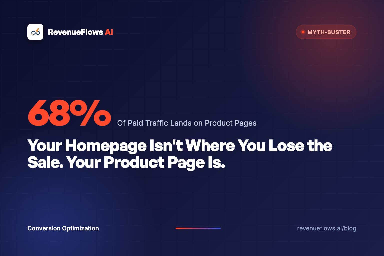
Your Homepage Isn't Where You Lose the Sale. Your Product Page Is.
Everyone redesigns the homepage. The traffic data disagrees with that priority. Here's where Shopify stores actually lose the sale, and what to do about it.

This is a common mistake. A costly one.
Most Shopify founders, when conversion drops, go straight to the homepage. New hero image. New navigation. New announcement bar. Maybe a full redesign.
Meanwhile, the actual problem, the product page, sits untouched. Broken. Leaking.
Here's the pattern we see in almost every Shopify audit we run: founders have polished, beautiful homepages they've iterated on 14 times. Their product pages look like they were built on a Friday afternoon and never touched again.
And yet, the product page is the only page in your entire store where a purchase decision actually gets made.
This post is the myth-buster. We'll show you the data on where customers actually drop off, why the homepage obsession is costing you real money, and what to do instead.
The Myth: "My Homepage Is My Store's First Impression"
This feels true. You built the homepage to communicate your brand. It's got your best photography, your brand story, your featured collections. It feels like the face of your business.
Here's the problem: most of your customers never see it.
In 2025, Shopify published aggregated traffic data across their merchant base. The result: 68% of paid traffic lands directly on product pages, not the homepage. Organic search traffic from Google is even more skewed, nearly 74% of search-intent visitors land on product pages or collection pages.
Your homepage is primarily seen by direct traffic: returning customers, people who typed your URL, people who already know your brand.
Your product page is seen by almost everyone who comes through an ad, a Google search, a social post, or an influencer link.
And yet, most Shopify brands spend 80% of their design and optimization budget on the homepage.
That's backwards.
Where Shopify Stores Actually Lose Customers
A pattern we see often in profit audits, across supplements, apparel, home goods, beauty, kitchen products, and pet accessories: the product page is where most purchase decisions die.
The homepage mostly sends people deeper into the store. The cart and checkout lose buyers to friction: shipping costs, form fields, trust, payment options. The product page is where the buying decision gets made, or doesn't.
Not the cart. Not checkout. The product page.
Yet most brands that come to us having "tried everything" have already:
- Reduced cart abandonment with pop-ups
- Optimized checkout with one-page checkout apps
- Redesigned their homepage
- Run retargeting ads to bring people back
They've tried everything except fixing the page where most of their abandonment actually happens.
Why the Product Page Is the Hardest Working Page in Your Store
Think about what a product page has to do.
In the 8–45 seconds a visitor spends on it, the page must accomplish all of the following:
1. Confirm identity
Is this the exact product I was looking for? Wrong images, wrong variant shown first, or a confusing title creates instant doubt. Visitors who doubt they've found the right product leave immediately.
2. Establish trust
Is this brand real? Is this product safe? Will it arrive? New visitors have zero prior relationship with your brand. The product page must build this trust from scratch, on every single visit.
3. Justify the price
Is this worth what they're charging? Price anchoring, value comparisons, and the "cost of not buying" argument all need to be made within the product page itself, before the visitor gets to the cart.
4. Handle objections
Sizing questions. Material questions. "Does this work for my situation?" questions. Durability questions. A product page that doesn't handle objections forces visitors to search for answers elsewhere. Most don't come back.
5. Build urgency
Without a reason to buy now, most visitors default to "I'll think about it." That's a polite way of saying they're not buying. The page needs a legitimate reason to act today, not fake countdown timers, but real scarcity, real consequences of waiting, real reasons this offer is better right now.
6. Stack the offer
The average order value a customer leaves with depends almost entirely on what's offered to them on the product page. Bundles. Complementary products. Quantity breaks. If these aren't woven into the page, the customer buys one unit and leaves. Or doesn't buy at all.
7. Close the sale
The add-to-cart button isn't a formality. Its placement, its copy, its color, its proximity to the last objection handled, all of it affects whether a visitor acts or hesitates.
Seven jobs. Most Shopify product pages do two or three of them.
That's the gap.
"A homepage is a brochure. A product page is a sales rep. You wouldn't send a brochure on a sales call."
The Revenue Per Visitor Lens: Why Most Founders Miss the Scale of the Problem
Let's make this concrete.
A bedding brand came to us with these numbers:
- Conversion rate: 1.0%
- Average order value: $125
- Revenue per visitor: $1.25
On 10,000 monthly visitors, that's $12,500 in revenue. Real client numbers, not typical results, and not a promise of what your store will do. See the full case study numbers.
Their homepage was beautiful. Studio photography. Clean typography. A compelling brand story about sustainable materials. They'd invested heavily in that homepage design.
Their product pages were functional. Product shots. A basic description. Some reviews at the bottom. The kind of page you build when you're in a hurry to launch and plan to "come back and improve it later."
After we rebuilt their product pages, new copy structure, objection-handling in the right sequence, a 78-second product demo video added in gallery position 2, review placement showing the right reviews next to the right hesitations, a bundle offer introduced at the offer stack section, the numbers changed:
- Conversion rate: 3.5%
- Average order value: $231
- Revenue per visitor: $8.10
On the same 10,000 monthly visitors: $81,000.
Same homepage. Same ads. Same prices. Same traffic. Different product pages.
The delta: $68,500 per month. $822,000 per year.
That's $822,000 sitting in a product page that nobody optimized while everyone was admiring the homepage.
For more on the revenue per visitor framework and why a single dollar of lift is worth $10,000/month on a 10,000-visitor store: Revenue Per Visitor Optimization: The Framework.
The 4 Specific Lies Your Metrics Are Telling You About the Homepage
Here's where it gets counterintuitive. Your analytics are probably pointing you in the wrong direction.
Lie 1: "Our homepage bounce rate is high, so the homepage is the problem."
Homepage bounce rate in Shopify analytics is widely misread. If a visitor lands on your homepage and clicks to a collection page, they're counted as "not bounced." But the click to the collection doesn't mean they're going to buy. What matters is what happens when they reach the product page.
Homepage bounce rate is a navigation metric. It tells you nothing about purchase conversion.
What predicts purchase conversion is product page exit rate, specifically, product page exits that happen before the visitor adds to cart. That's your actual revenue problem.
Lie 2: "People can't find products, so navigation is the issue."
This feels right when collection page exit rates are elevated. And sometimes it's true, a messy collection structure can hide products.
But in most stores we audit, visitors do find the product page. They land there from a Google search or a paid ad. They look at the page. They leave. That's not a navigation failure. That's a product page failure. The product was found. It just didn't close the sale.
Lie 3: "Our add-to-cart rate is fine, so the product page isn't the issue."
Add-to-cart rate masks a massive amount of leakage. We regularly audit stores with a 6–8% add-to-cart rate and a 0.9% purchase conversion rate. That's a 7:1 cart abandonment ratio.
The product page got them to the cart. Then they had second thoughts. And those second thoughts were usually planted on the product page itself, an unanswered objection about durability, an unclear return policy, a price that seemed high without sufficient value context.
The product page created the doubt. The cart revealed it.
Lie 4: "Our customers are comparison shopping, so retargeting will fix it."
Some are comparing. But most are abandoning because the page didn't close the deal on the first visit.
Retargeting brings them back to the same page that failed them. Without fixing the page, you're paying to re-expose the same visitors to the same failure point. It's pouring water into a bucket with a hole, and calling the water the problem.
The Full Anatomy of a Product Page That Does All 7 Jobs
Here's what a product page looks like when it's actually working.
Above the Fold (Hero Section)
- First image: Product in use, not floating on white. Shows context: who's using it, where, why.
- Headline: Names the customer AND the outcome. Not "Magnesium Glycinate 200mg." Try: "For the person who sleeps 8 hours and still wakes up tired."
- Subhead: Handles the biggest objection upfront. "Third-party tested. 60-day guarantee. Ships in 2 days."
- Price: With a clear value anchor, compare-at price, per-unit breakdown, or cost-per-use calculation.
- Add-to-cart button: Visible without scrolling on desktop. Sticky on mobile. Always visible.
Evidence Section (First Scroll Depth)
- Social proof summary: "4.8 stars · 2,341 reviews", specific numbers, not "thousands of happy customers"
- Star distribution: Shows reviews are genuine (not all 5-star)
- Video: In position 2 of the gallery. 45–90 seconds. Product in real use, not a studio shoot. (See: How to Use Video on Your Shopify Product Page)
- 3 trust badges: Return policy, shipping guarantee, secure payment, visible here, not buried in the footer
Copy Section (Second Scroll Depth)
- Not a bullet list of features, a narrative that maps features to outcomes
- Each benefit tied to a specific customer scenario ("If you're doing training weeks of 50+ miles...")
- One polarity per product: what their life looks like WITH this vs. WITHOUT it
- Short paragraphs. One idea each. No walls of text.
Objection Handling (Third Scroll Depth)
- FAQ section: Not at the bottom, visible within scroll depth 3, positioned between the copy and the offer stack
- Minimum 3 review callouts: Each positioned next to the objection it answers, sizing reviews next to the size chart, durability reviews next to the materials section
- Ingredient/material breakdown: For supplements, food, apparel, what's in it, what's not, and why that matters
Offer Stack (Fourth Scroll Depth)
- Bundle or "most popular" option: Visually differentiated, a highlighted card, a "most popular" badge, a color change
- Quantity break pricing: Visible on the product page itself, not revealed only in the cart
- Complementary product recommendation: "Often used with..." shown before the add-to-cart, not as a post-purchase upsell
Close (Bottom of Page)
- Second add-to-cart button: Essential for long pages, place it below the offer stack
- Final proof point: One specific customer quote that captures the transformation: "I was skeptical. Took it for 12 days. Third morning I woke up before my alarm."
- Return policy, one sentence: "If it doesn't work, we ship a replacement. No forms. No wait."
This isn't a redesign project. It's a conversion architecture project.
Design projects are about aesthetics. Conversion architecture is about the specific sequence of information that takes a skeptical stranger and turns them into a buyer. Different discipline. Different outcomes.
The 15-Minute Product Page Diagnostic
Before rebuilding anything, diagnose the actual problem.
Step 1: Open Google Analytics 4. Go to Explore → Path Exploration. Set the entry point as your top 3 product pages. Look at the drop-off between "Product page view" and "Add to cart."
If you're losing more than 92% of visitors between those two events, your product page has a conversion architecture problem.
Step 2: Open Microsoft Clarity (free). Watch 20 sessions of visitors who landed on your top product page and left without adding to cart.
Watch specifically for:
- Rage clicks (frustration with a specific non-functional element)
- Scroll depth (how far they got before leaving)
- Exit moment (which section was on screen when they closed the tab)
In 15 minutes of session recordings, you'll see the actual problem. Not a hypothesis. Not a gut feeling. The exact behavior.
Most founders have made 14 changes to their homepage based on what they "feel" is right, and zero changes to their product page based on actual visitor behavior.
The 15-minute diagnostic changes that.
Step 3: Map what you find to the 7 jobs above. Which job is the product page failing at? Identity confirmation? Objection handling? Offer stacking? The job it's failing at tells you exactly which section to fix first.
Why the Homepage Redesign Feels Right (And Why That Feeling Costs Money)
There's a psychological reason founders gravitate to the homepage.
The homepage is visible the moment you open your store. It's the first thing you see when you review your brand. It's what you show people at a conference when you say "here's my store." It's what investors and partners look at.
It represents you.
The product page represents your product. And most founders don't want to believe the product page is the problem, because fixing the product page means admitting the thing they built to sell the thing isn't working.
That's a harder conversation than "we need a better homepage design."
But here's the thing: the product page doesn't have to be personal. It's a conversion tool. And conversion tools get measured, iterated on, and improved, not loved and left unchanged.
The founders who grow past $200,000/month and sustain it aren't the ones with the prettiest homepages. They're the ones who've ruthlessly optimized the moment of truth: the product page, the conversion architecture, the sequence of information that takes a stranger and makes them a buyer.
The Compounding Effect: Why Product Page Optimization Pays Forever
One more lens before the CTA.
When you fix your product page, every dollar you spend on ads gets more efficient immediately. If revenue per visitor goes from $1.25 to $2.50, you've halved your effective cost per acquisition. You can now bid higher on the same keywords, reach more customers, and still be profitable.
When your product page is optimized, retargeting campaigns work better. You're bringing people back to a page that can actually close them, not re-expose them to the same failure.
When your email flows trigger after a product page exit, they're supplementing a page that handled most objections. The email needs to deliver one more nudge, not rebuild the entire case.
The product page is the foundation. Every other channel, ads, email, retargeting, SEO, influencer, amplifies whatever the product page does. Fix the foundation first.
A homepage redesign doesn't compound. A product page rebuild compounds every day, on every channel, on every ad click, for the life of the product.
What to Do Starting Today
If you have 15 minutes: Run the diagnostic above. Open Clarity. Watch 20 sessions. Map what you find to the 7 jobs.
If you have a day: Run a full product page audit on your 3 highest-traffic products. Score each against the anatomy section above. Count which jobs they're missing.
If you want someone to do it for you: Get a profit audit from RevenueFlows AI. We look at your top product pages, identify the specific revenue leaks, and show you how to rebuild a high-converting product sales page in less than 15 minutes.
For a deeper look at what a qualified product page specialist should do, and the questions to ask before hiring: Shopify Product Page Consultant: What to Look For in 2026.
For the video component specifically, format, placement, and the 3-act structure that works: How to Use Video on Your Shopify Product Page to Boost Sales.
The Closing Argument
Your homepage is not where the sale happens.
Your homepage is where curious people go to browse. Your product page is where skeptical people go to decide.
The browser doesn't need convincing. The decider does.
Every dollar you spent on the homepage while your product pages were broken was a dollar that couldn't close. Every visitor who landed on an underperforming product page was a visitor you paid to send, and then watched leave.
Fix the product page. Let the homepage be beautiful.
But make the product page work.
Book Your Profit Audit
Your homepage isn't the problem. Let's find out what actually is.
Get your free profit audit and we'll show you how to rebuild a high-converting product sales page in less than 15 minutes.
Frequently asked questions
Why do most Shopify stores focus on the homepage instead of product pages?
Founders see the homepage first when they visit their own store. It feels like the brand's 'face.' But most customers land directly on product pages from ads and Google search, they may never see your homepage at all.
How do I know if my product page is the real conversion problem?
Check your page-level exit rate in Google Analytics 4. If product pages show 60%+ exit rates and your add-to-cart rate is under 5%, the product page is the primary leak, not the homepage.
What's the difference between a homepage conversion rate and a product page conversion rate?
Homepage 'conversion' typically means visitors clicking through to products or collections, a navigation event, not a purchase. Product page conversion means add-to-cart and checkout completion. These measure completely different behaviors.
How much does a 1% product page conversion lift actually affect revenue?
On a store with 10,000 monthly visitors and an average order value of $120, a 1% conversion rate lift equals $12,000 in additional monthly revenue, without spending a dollar more on ads.
Should I ever redesign my homepage?
Yes, but only after your product pages are optimized. Homepage redesigns affect returning visitors and direct traffic. Product page optimization affects every paid click, every organic search visitor, and every social referral. Fix the higher-leverage lever first.